
An identity that didn't ask for permission to be in the room.
Papo Pretx is a collective born within the advertising agency Leo Burnett Brazil, focused on advancing racial diversity and creating safer spaces for Black professionals. How to translate this power visually?
Visual identity - Art direction - Logo design - Collage illustration - Print and digital templates
Challenge:
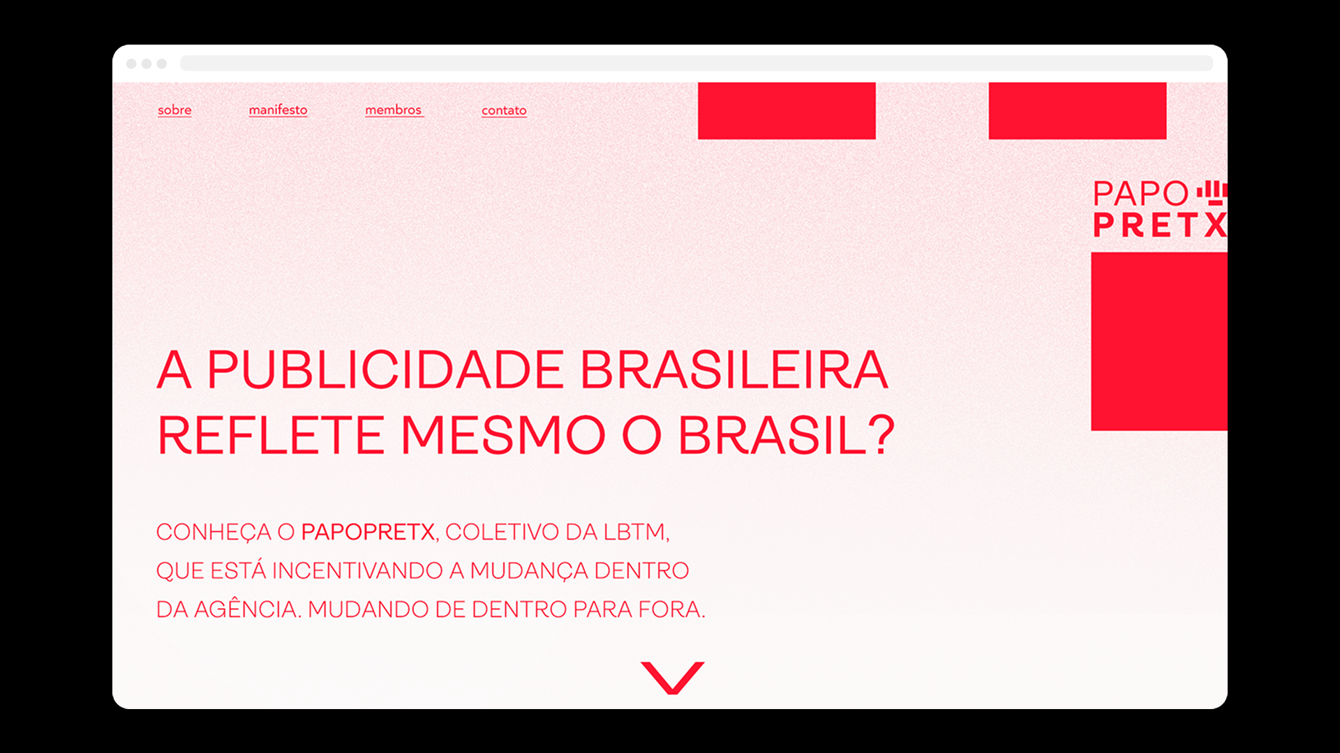
The collective operated under the Leo Burnett HR umbrella, which meant it needed to be recognisable as its own thing. Something employees could spot, feel, and identify with. Without a visual identity, it risked being absorbed into corporate noise.
I volunteered to lead the visual work. The rest of the collective, people from planning, account management, and data, shaped everything else: the strategy, the activations, the culture we were building together.
Solution:
The collective operated under the Leo Burnett HR umbrella, which meant it needed to be recognisable as its own thing. Something employees could spot, feel, and identify with. Without a visual identity, it risked being absorbed into corporate noise.
I volunteered to lead the visual work. The rest of the collective, people from planning, account management, and data, shaped everything else: the strategy, the activations, the culture we were building together.
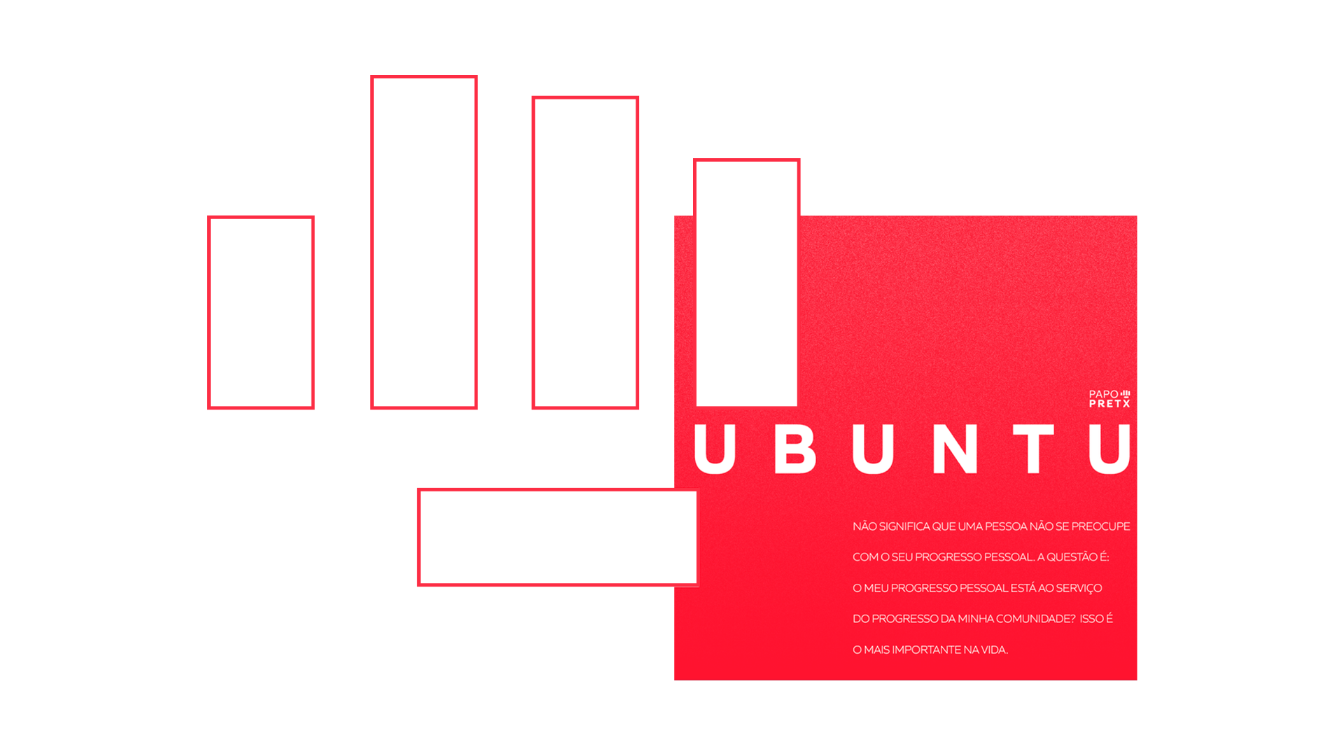
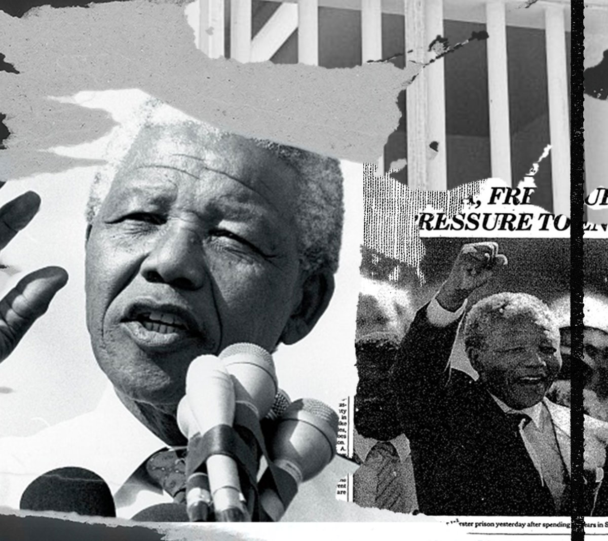
Pieces into power:
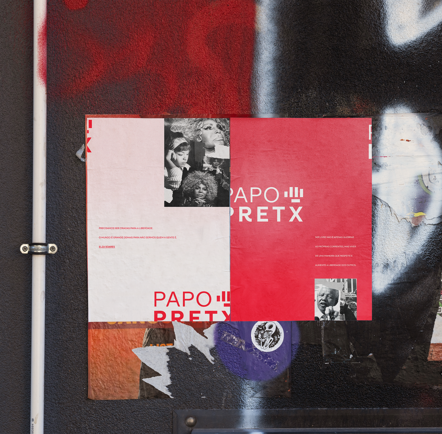
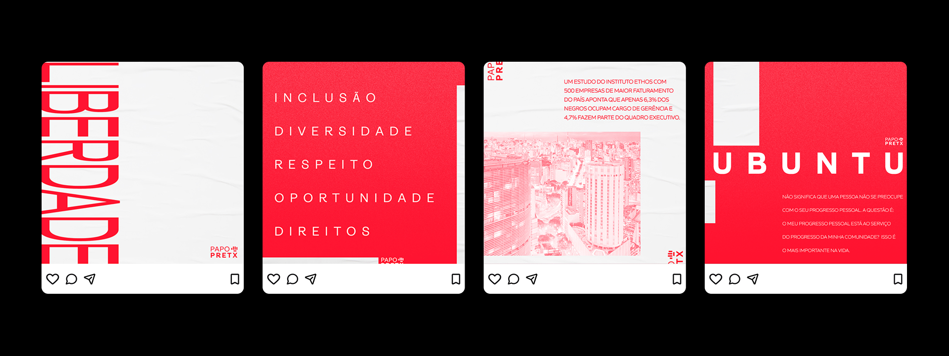
Alongside the logo, a collage visual style emerged as the identity's expressive mode layered images, bold crop, texture over clean surfaces. It referenced the cut-and-paste energy of zines and music journalism, and gave the collective a way to produce material that felt handmade and urgent, even in a corporate setting.
Next steps:
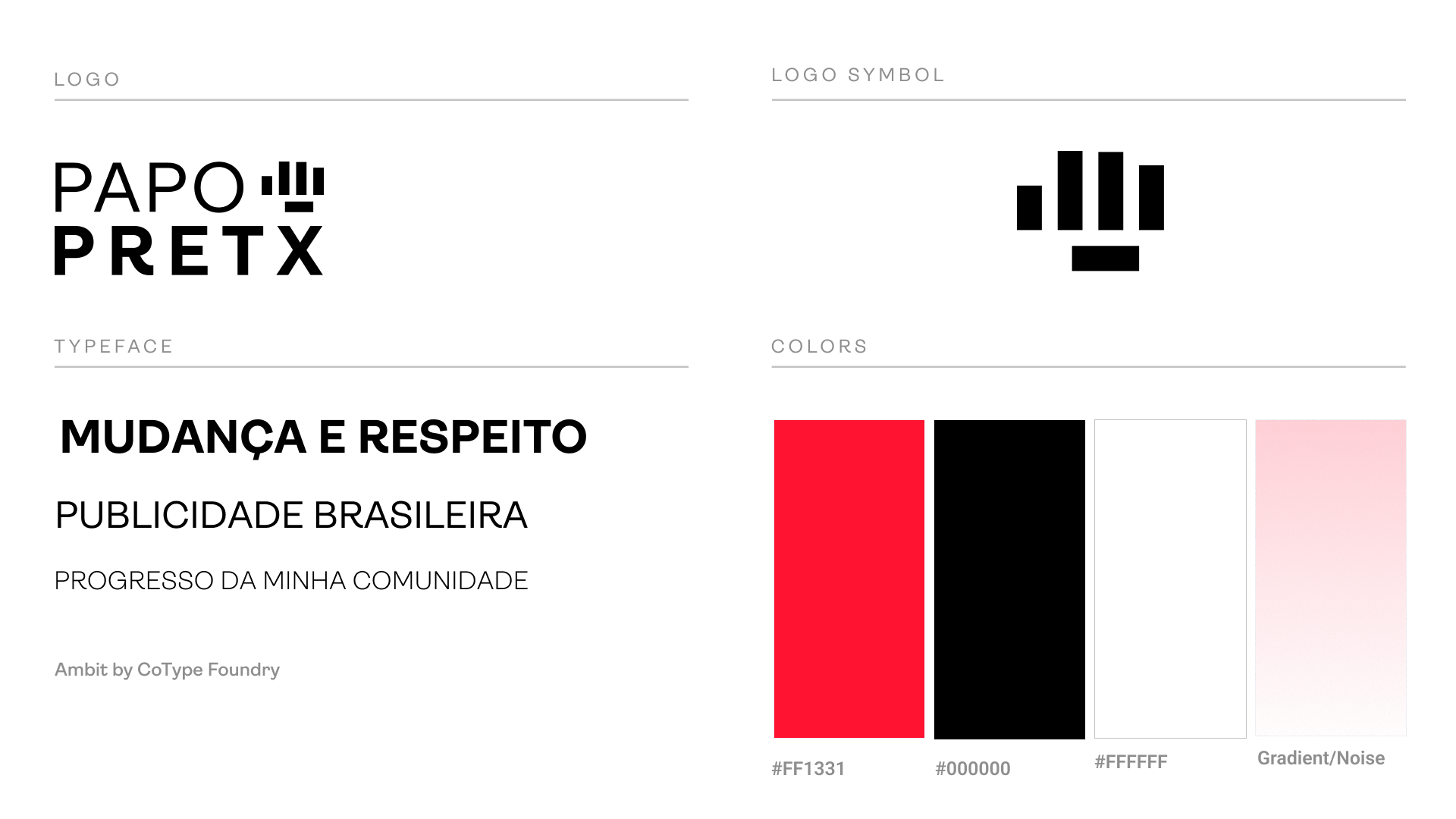
In practice, corporate communication restrictions meant the full color palette was dropped from official materials. Only the logo and collage style were formally adopted. What's presented here is the complete vision — the identity as it should exist, and as I'd build it given full creative autonomy. This is the work I would ship.